this post was submitted on 27 Aug 2023
330 points (97.7% liked)
Data Is Beautiful
6800 readers
2 users here now
A place to share and discuss data visualizations. #dataviz
(under new moderation as of 2024-01, please let me know if there are any changes you want to see!)
founded 3 years ago
MODERATORS
you are viewing a single comment's thread
view the rest of the comments
view the rest of the comments
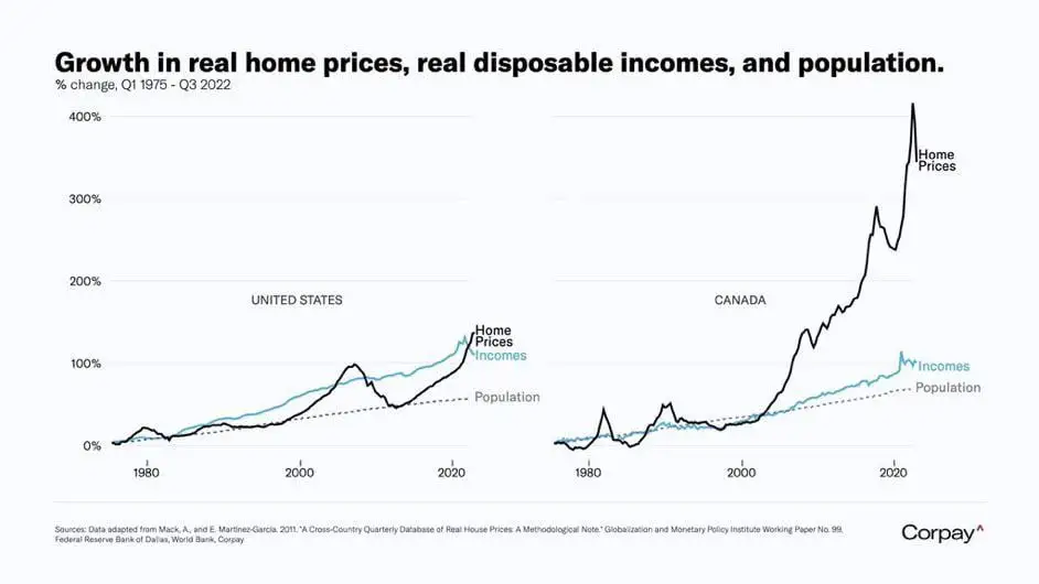
This graph would look much different if it compared home prices in 2022-2023.
What do you mean
Home in the US shot up in price around the end of 2021 and peaked earlier this year. I wonder how the comparison looks after that spike.