this post was submitted on 27 Aug 2023
330 points (97.7% liked)
Data Is Beautiful
6800 readers
2 users here now
A place to share and discuss data visualizations. #dataviz
(under new moderation as of 2024-01, please let me know if there are any changes you want to see!)
founded 3 years ago
MODERATORS
you are viewing a single comment's thread
view the rest of the comments
view the rest of the comments
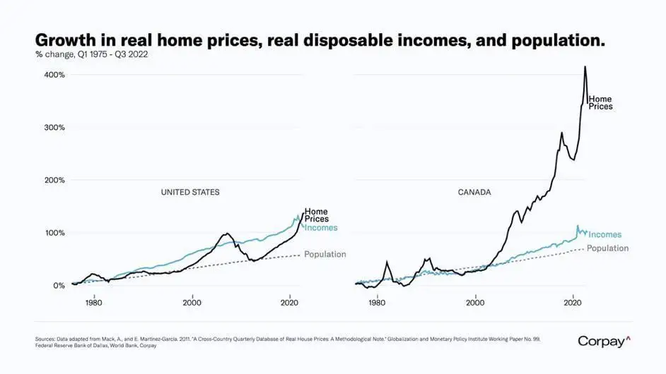
This graph is so location dependent for the US. Where I am, home prices have gone up well over 10x since 1980. There are many places in the US where it is just as bad, or even worse than the average in Canada.
The issue in Canada is also location dependent, some areas 10x plus others not. But even worse is that housing across the board has gone up as people flee the high price areas, bringing demand to the cheaper areas, and therefor raising the prices.
There are a few areas that have become so impossible to afford (Canmore, Banff, Vancouver etc.) that the lower earning workers are living in tents (this also happens in the states but is new there I hear).
Yeah my home town that's a little over an hour outside of a city has small houses selling for half a million (CAD) now. I don't even know how anyone from the town would afford that on their retail or factory work income